Beyond Components
Transforming fragmented interface decisions into a scalable design system that enabled faster product delivery, greater consistency and a stronger foundation for future growth.

“A design system becomes valuable when it scales not only interfaces, but also the quality, consistency and confidence of every product decision.”
- Client
- Independent Initiative
- Industry
- Design Systems & Product Engineering
- Year
- 2025
- Role
- Creator
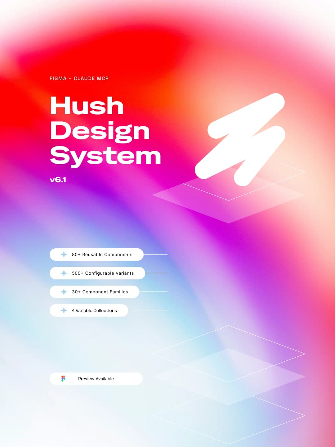
Digital products rarely remain shallow for long. As new features and customer journeys emerge, interface decisions multiply making them increasingly difficult to maintain. Without a shared foundation, patterns diverge, documentation loses relevance and design debt quietly accumulates across the product.
HUSH began as an exploration of how intentional systems could replace isolated decisions with reusable knowledge, enabling products to evolve with greater clarity, consistency and long-term confidence.
Rather than beginning with components, HUSH began by establishing the principles that would guide every future design decision. The objective was to create a foundation that could evolve predictably as products, teams and requirements changed.
These principles influenced everything from token architecture and component behaviour to accessibility, documentation and governance. By treating design decisions as a connected system rather than isolated solutions, HUSH established a consistent framework that could support sustainable product growth.
Intent before implementation
Systems over individual components
Consistency through shared decisions
Accessibility as a default
Documentation as part of the design process
Scalability through reusable foundations
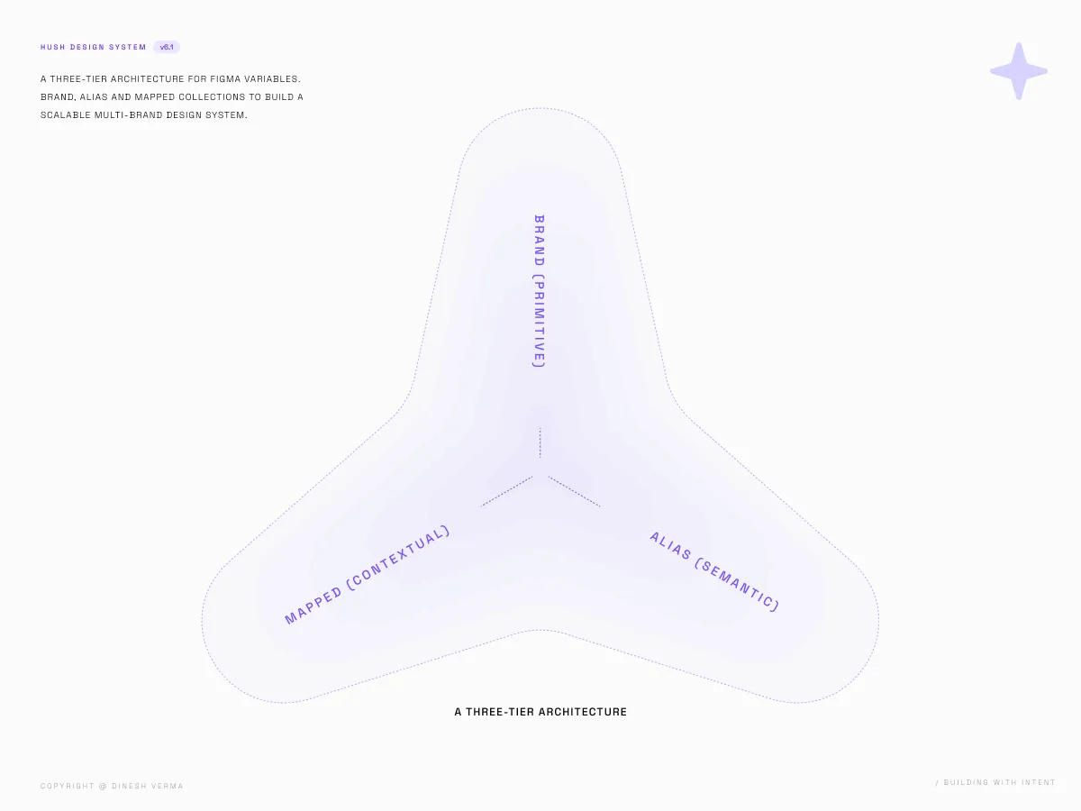
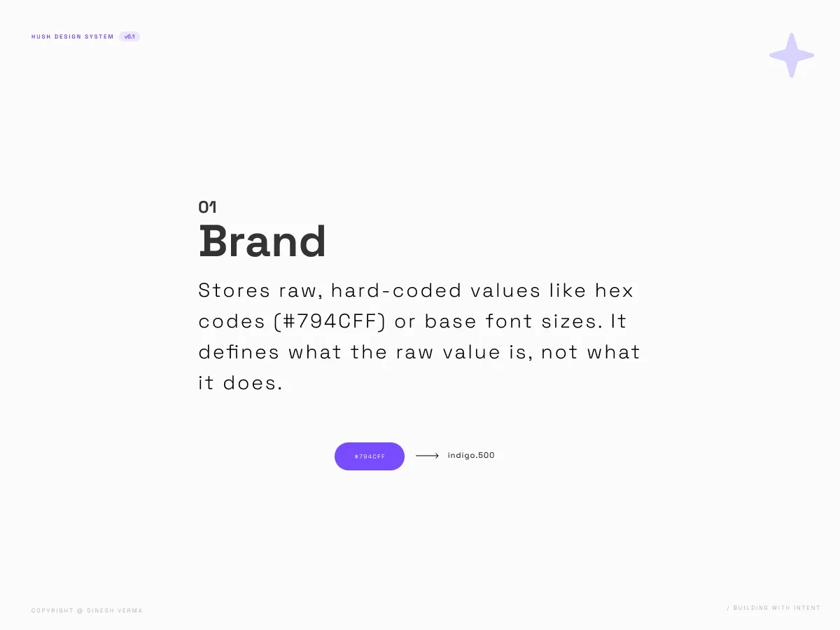
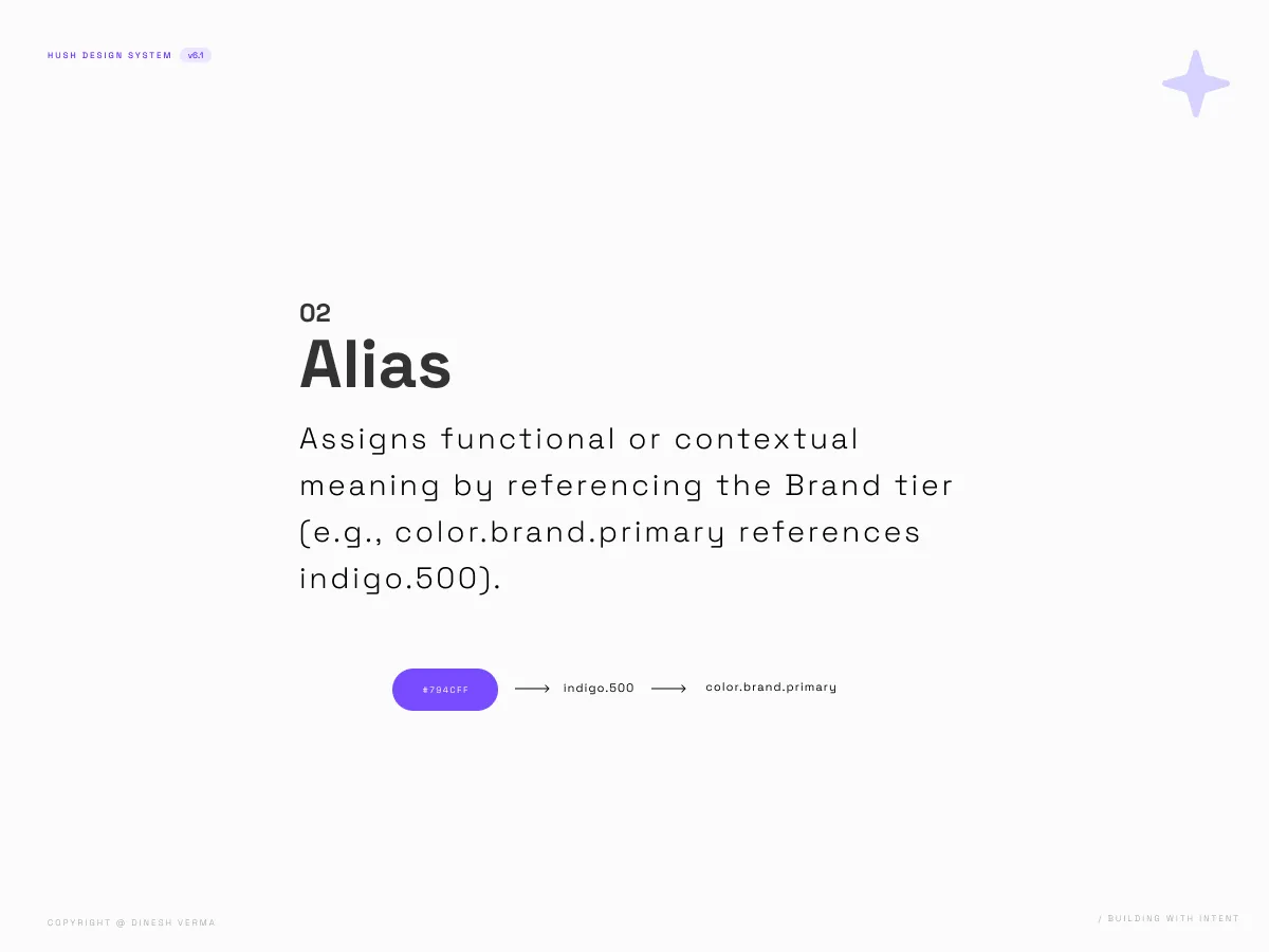
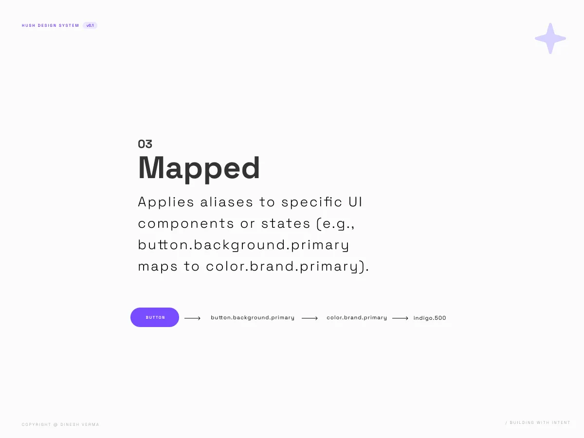
HUSH was structured around reusable foundations rather than isolated interface elements. Design tokens established a consistent visual language, while a modular component architecture ensured patterns could be extended without introducing unnecessary complexity.
Variants, shared behaviours and standardized properties reduced duplication and created predictable design decisions across the system. By separating foundational rules from individual components, the architecture remained flexible enough to support new requirements while preserving consistency across the product experience.
Design Token System
Component Architecture
Variant Strategy
Shared Properties
Interaction Patterns
Naming Conventions
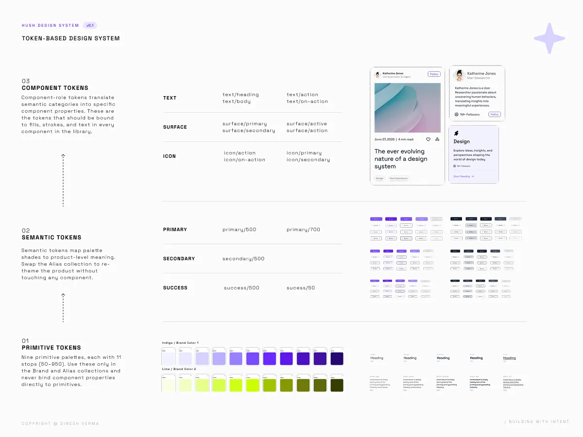
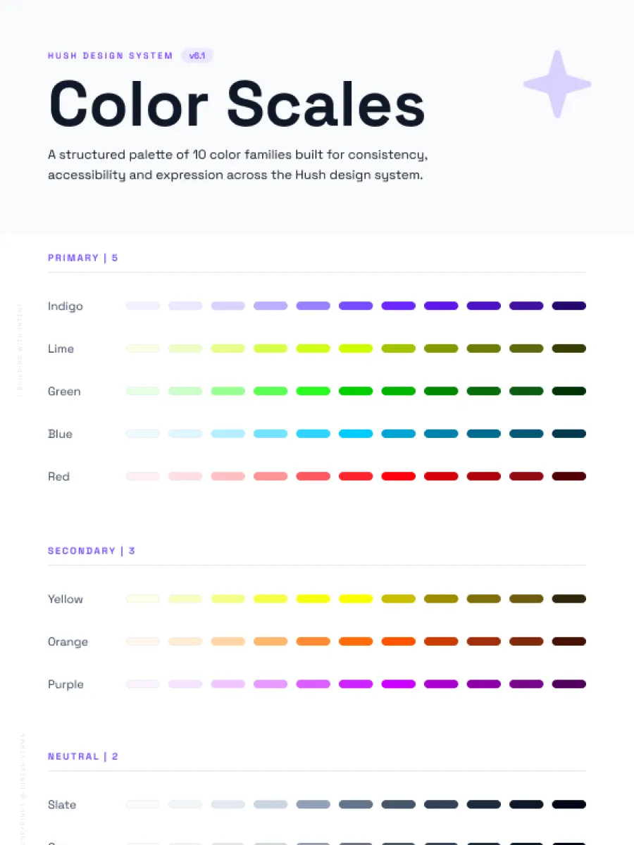
Image 1 of 6
A scalable system requires more than reusable components. It depends on a governance model that guides how decisions are made, documented and adopted over time. HUSH integrates accessibility standards, documentation practices and consistent naming conventions to create a shared understanding across the system.
By treating governance as an integral part of the design process rather than an afterthought, the system encourages consistency, simplifies collaboration and supports long-term maintainability as products continue to evolve.
Documentation Standards
Accessibility Guidelines
Naming Conventions
Component Usage Guidelines
Design Review Principles
System Maintenance Approach
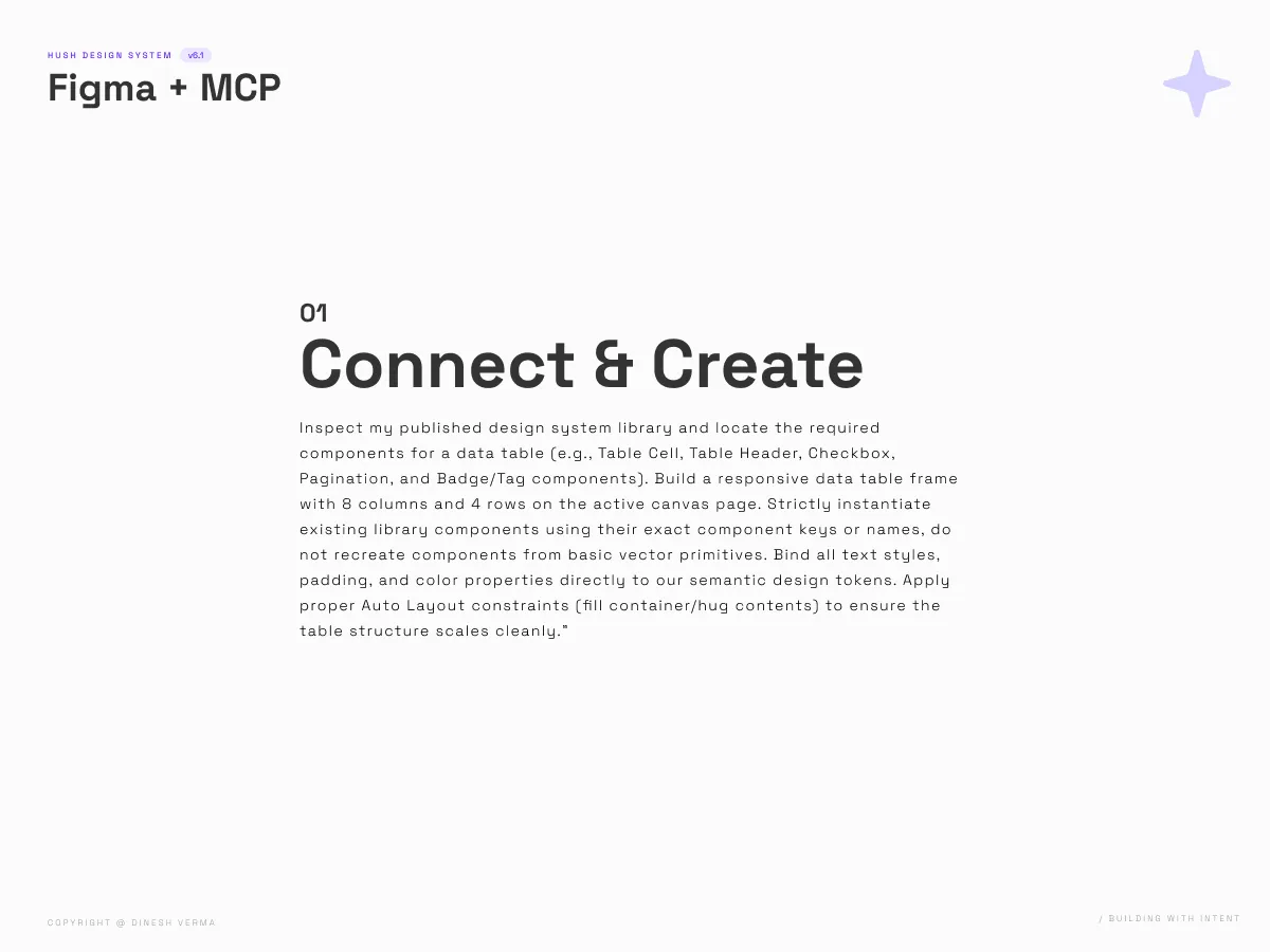
HUSH explored how AI could become a practical collaborator throughout the design system workflow without replacing critical thinking. Claude, combined with the Figma MCP integration, accelerated documentation, component exploration and design iteration while maintaining alignment with the system's architectural principles.
Rather than generating isolated outputs, AI operated within a clearly defined framework where prompts, documentation and design decisions reinforced one another. This approach reduced repetitive work, improved consistency and enabled faster exploration without compromising the integrity of the system.
Structured Prompting
Claude Collaboration
Figma MCP Integration
AI-assisted Documentation
Component Exploration
Iterative Design Validation
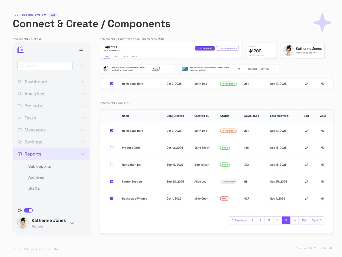
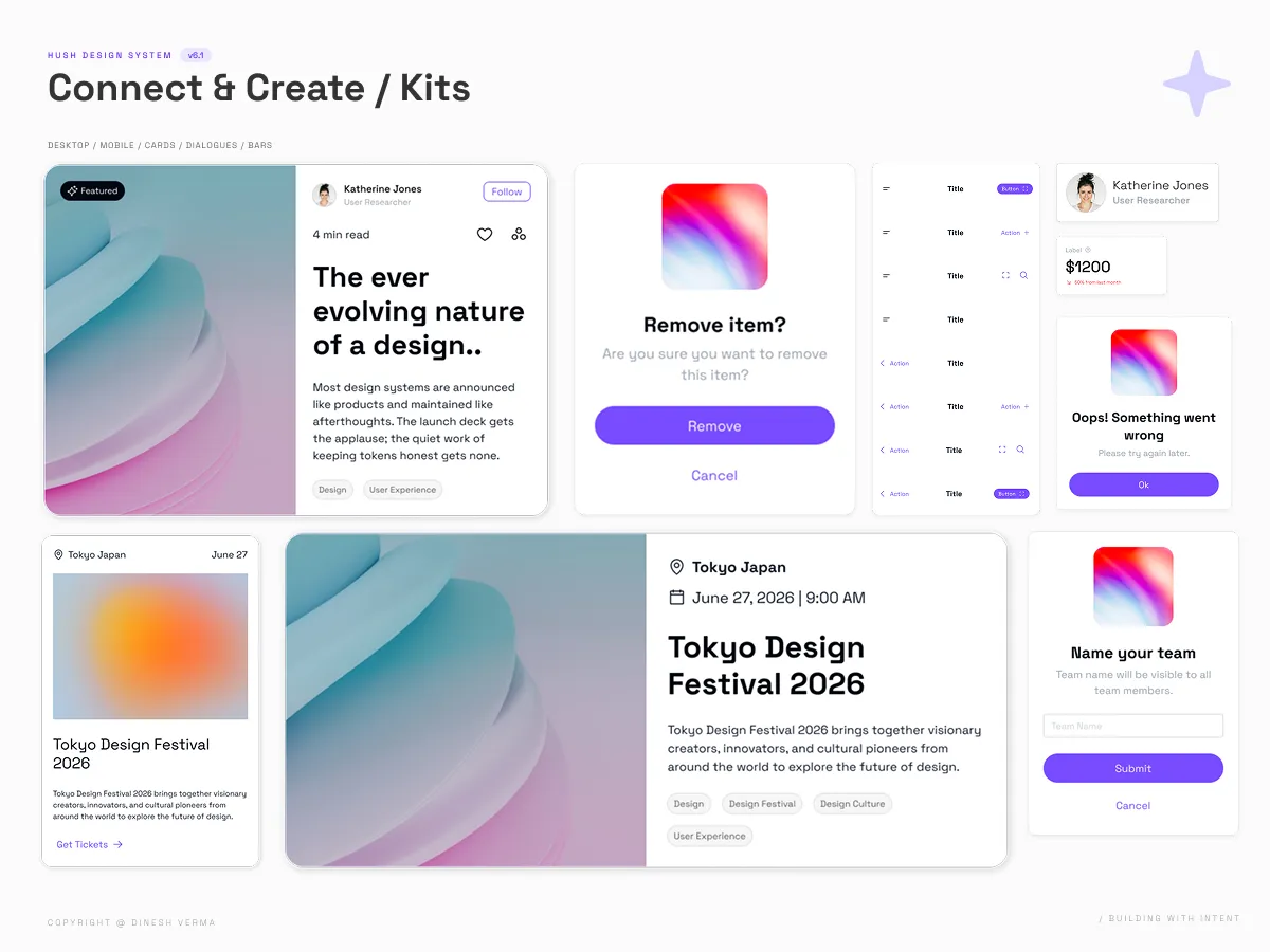
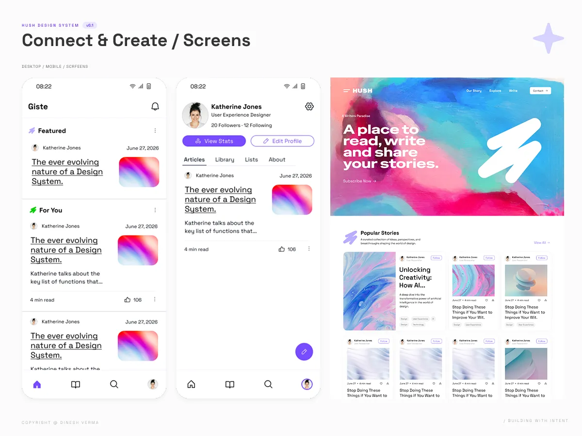
The initiative resulted in a production-ready design system comprising reusable foundations, standardized components and comprehensive documentation. Every layer of the system was intentionally designed to improve consistency, simplify collaboration and support future product evolution.
Beyond the interface, HUSH established a repeatable framework for designing, documenting and governing digital experiences. The combination of architectural thinking and AI-augmented workflows demonstrated how modern design systems can evolve more efficiently without compromising quality or long-term maintainability.
Token-Driven Design Foundations
Modular Component Library
Variant Architecture
Accessibility Standards
Design System Documentation
AI-Augmented Design Workflow
Scalable products are built on intentional systems, not accumulated features.